 |
  DataGridColumns .NET assembly (for VB.NET, C#, C++)
|
|
|
A quantity of jobs you may want to achieve with the Windows Forms DataGrid control are, unexpectedly, more troublesome than you might expect. Principally, this is because the Windows Forms DataGrid control is column-based, rather than cell-based. As a result, to attain most tasks, you have to work with the columns, not the cells themselves.
|
|
Thanks Guys, these controls ROCK!
Drew McLain, Director of Technology, Express Dynamics
|
|

|
|
|
The DataGridColumns assembly works exceptionally well. It does all the things that I needed it to do! You have created an excellent product!
Stephen Hamburg, IT Engineer
|
|
|
|
By using the assembly you can create your own set of DataGridColumnStyle objects that defines custom column styles for the Windows Forms DataGrid control and add them to the GridColumnStylesCollection.
|
|
|
|
A column style is an object that defines what the column looks and behaves like, including such things as color, font, and the presence of controls that will handle linked field in a database with the use of a Combo Box, a Check Box and other control. The .NET Framework includes two types of column-style classes by default: the DataGridTextBoxColumn and DataGridBoolColumn classes.
DataGridColumns dynamic link library contains the following DataGrid Column Styles:
|
  DataGrid combobox column Style DataGrid combobox column Style
  How to change the background color for DataGridComboBoxColumn columns in a datagrid? What about other properties? How to change the background color for DataGridComboBoxColumn columns in a datagrid? What about other properties?  How to setup the combo box that filters values from a related child table? How to setup the combo box that filters values from a related child table?  How to enclose a nesting Dictionary to other Dictionary datagrid? How to enclose a nesting Dictionary to other Dictionary datagrid?  How to define columns for a Dictionary datagrid? How to define columns for a Dictionary datagrid?
  Please read the DataGridColumns assembly documentation to learn more about the DataGridComboboxColumn class provided events and class members. Please read the DataGridColumns assembly documentation to learn more about the DataGridComboboxColumn class provided events and class members.
  DataGrid XP Button column Style DataGrid XP Button column Style
 |
 |
DataGridXPButtonColumn allows you to provide the datagrid interface your users are requesting, while supporting the utterly powerful Microsoft .NET DataGrid control. The DataGridXPButtonColumn makes the MS .NET DataGrid control one of the most powerful controls that you ever had used. A RustemSoft DataGridXPButtonColumn column in a .net DataGrid control gives you ability to define custom functionality for items in the grid beyond the edit, delete, select, and hyperlink features of other column types. For example, you can use a DataGridXPButtonColumn to create a "Link to a website" button.
The DataGridXPButtonColumn has a pushbutton-style only. The button captions can be a text read from a database.
When you define a button column, you specify a command associated with the button. The Click event of DataGridXPButtonColumn class occurs when the user clicks the button, the button's command is passed to a container where you can handle it with your custom code.
|
|
  How to react to DataGridXPButtonColumn Click event in your code? How to react to DataGridXPButtonColumn Click event in your code?
  Please read the DataGridColumns assembly documentation to learn more about the DataGridXPButtonColumn class provided events and class members. Please read the DataGridColumns assembly documentation to learn more about the DataGridXPButtonColumn class provided events and class members.
  DataGrid Memo column Style DataGrid Memo column Style
The RustemSoft DataGridMemoColumn gives you a useful Memo Field control, which presents an edit window when user selects a cell of the DataGrid Memo Column on .NET DataGrid. This provides a pop-up memo field editor that you can call from your code at any time to let users edit the text in a memo field.
|
 |
|
This Memo field editor provides more flexibility by updating the memo field to be used in a .NET DataGrid column.
The DataGrid Memo Column Memo field editor is useful for showing short document contents, like memos and emails.
The DataGridMemoColumn includes a cancel feature. If you click OK the changes made are sent back to the table. When you click on the 'x'-button in the upper right corner or Cancel button your changes will not be stored. You may hide the Cancel button by using the showCancelButton property.
When using the DataGrid Memo Column editor you are automatically provided with all general features, which any typical, contemporary word processor has.
|
  Please read the DataGridColumns assembly documentation to learn more about the DataGridMemoColumn class provided events and class members. Please read the DataGridColumns assembly documentation to learn more about the DataGridMemoColumn class provided events and class members.
  DataGrid Button column Style DataGrid Button column Style
 |
 |
DataGridButtonColumn ColumnStyle represents standard window button in your DataGrid customized column and has the same functionalities like DataGridXPButtonColumn component, which is described above. Except Syntax and Parameters
|
  Please read the DataGridColumns assembly documentation to learn more about the DataGridButtonColumn class provided events and class members. Please read the DataGridColumns assembly documentation to learn more about the DataGridButtonColumn class provided events and class members.
  DataGrid DateTimePicker column Style DataGrid DateTimePicker column Style
The DateTimePicker ColumnStyle is used to allow the user to select a date and time, and to display that date/time in your DataGrid.
|
  Syntax Syntax
DataGridDateTimePicker()
|
  How to change the display format for DateTimePicker columns in a datagrid? What about other properties? How to change the display format for DateTimePicker columns in a datagrid? What about other properties?  How to delete a value from DateTimePickerColumn cell? How to delete a value from DateTimePickerColumn cell?
  Please read the DataGridColumns assembly documentation to learn more about the DataGridDateTimePicker class provided events and class members. Please read the DataGridColumns assembly documentation to learn more about the DataGridDateTimePicker class provided events and class members.
  DataGrid DateTime Column Style DataGrid DateTime Column Style
 |
 |
You have a DataGrid with a DateTime field that displays the date/time as "2/20/2005 7:00:00 PM". You would like to display only the time in the following format "7:00 PM". You would like to insert a new time in the column or update current time value only. Let us suppose that you are European and would like to see in date field something like "20.02.2005". The DataGridDateTimeColumn style can help you design the concept that will resolve your needs.
The DateTime ColumnStyle is used to allow the user to insert formatted date and time, and to display that date/time in your DataGrid.
|
  Syntax Syntax
DataGridDateTimeColumn(Format, DefaultValue, DelimiterChar)
  Parameters Parameters
Format - Various formats may be set. You may use a date/time format (like MMDDYY, MMDDYYYY, DDMMYY, DDMMYYYY, YYYYMMDD, HHMM12, HHMMSS12, HHMM24, HHMMSS24) to enable the date/time inserting and updating. Default is MMDDYYYY.
DefaultValue - any DateTime value. For example, you can set the DefaultValue to today's date. Default is empty DateTime (null/Nothing).
DelimiterChar - a delimiter between date/time fractions (between days and month or hours and minutes). Default is "/".
|
  How to turn off error messages? How to define error messages in my native language? How to turn off error messages? How to define error messages in my native language?
  Please read the DataGridColumns assembly documentation to learn more about the DataGridDateTimeColumn class provided events and class members. Please read the DataGridColumns assembly documentation to learn more about the DataGridDateTimeColumn class provided events and class members.
  DataGrid Numeric Column Style DataGrid Numeric Column Style
  How to turn off error messages? How to define error messages in my native language? How to turn off error messages? How to define error messages in my native language?  How to change the background color for DataGridNumericColumn columns in a datagrid? How to change the background color for DataGridNumericColumn columns in a datagrid?
  Please read the DataGridColumns assembly documentation to learn more about the DataGridNumericColumn class provided events and class members. Please read the DataGridColumns assembly documentation to learn more about the DataGridNumericColumn class provided events and class members.
  DataGrid Text Fractions Column Style DataGrid Text Fractions Column Style
 |
 |
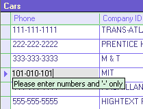
This formatted intelligent TextFractionsColumn style control can mask the text fractions. It gives you ability to manage the IP Address, SS#, Phone numbers, etc., and checks the validation, and automatically set the delimiter location.
The TextFractionsColumn style is useful in several situations. For example, this control will automatically format a telephone number so when a user enters their phone number like this:
123-456-7890
or
1234567890
it will automatically change the numbers in the column text updating box.
|
  How to specify the column's text fractions properties? How to specify the column's text fractions properties?  How to turn off error messages? How to define error messages in my native language? How to turn off error messages? How to define error messages in my native language?  How to specify the 'Password' text column for inserting and displaying passwords only? How to specify the 'Password' text column for inserting and displaying passwords only?
  Please read the DataGridColumns assembly documentation to learn more about the DataGridTextFractionsColumn class provided events and class members. Please read the DataGridColumns assembly documentation to learn more about the DataGridTextFractionsColumn class provided events and class members.
  DataGrid Check Column Style DataGrid Check Column Style


|
DataGrid Check column style accepts and displays true, false values. The RustemSoft DataGridCheckColumn control specifies a column in which each cell contains a check box for representing a Boolean value.
The Check Column in a default state, is used in a similar manner as the standard Microsoft DataGridBoolColumn binding to a boolean datacolumn and displaying a checkbox.
Besides using Boolean data type field as a source field you can use also String data type and any Numeric data types source field of your data source DataTable object. At run time, the DataGridCheckColumn contains check boxes in each cell that have two states:
|
  Please read the DataGridColumns assembly documentation to learn more about the DataGridCheckColumn class provided events and class members. Please read the DataGridColumns assembly documentation to learn more about the DataGridCheckColumn class provided events and class members.
  DataGrid Label Column Style DataGrid Label Column Style

 |
The control creates a column of Labels mapped to DataColumn of type String.
The RustemSoft DataGridLabelColumn provides you with a read-only cell. It gives you ability to set all column desired colors and raises an event when the cell is clicked allowing you to interact to the event in your code.
The DataGridLabelColumn raises a Cell event when the user clicks on a cell you can react to this event in your code.
|
  DataGrid TextEdit Column Style DataGrid TextEdit Column Style

 |
The RustemSoft DataGridTextEditColumn gives you a useful TextEdit Field control, which presents an edit area when user selects a cell of the DataGrid TextEdit Column on .NET DataGrid. When using the TextEdit you are automatically provided with a vertical scrollbar and the ability to put carriage returns in your data using the 'Enter' key. Also all general features, which any typical, contemporary word processor has, are provided. According to the nature of the DataGrid navigation 'Tab' characters are not supported by the DataGridTextEditColumn.
This TextEdit field editor provides more flexibility by updating the TextEdit column to be used in a .NET DataGrid column.
|
The DataGrid TextEdit Column TextEdit field editor is useful for showing short document contents, like Memos and emails.
The DataGridTextBoxColumn provides several events, that enables you interact the events in your code.
|
  Syntax Syntax
DataGridTextEditColumn()
|
  Please read the DataGridColumns assembly documentation to learn more about the DataGridTextEditColumn class provided events and class members. Please read the DataGridColumns assembly documentation to learn more about the DataGridTextEditColumn class provided events and class members.
  DataGrid DomainUpDown Column Style DataGrid DomainUpDown Column Style

 |
The RustemSoft DataGridDomainUpDownColumn represents a datagrid column style up-down control that displays string values. It allows you to show a DomainUpDown control in a Datagrid cell.
The control displays in a datagrid cell a single string value that is selected from a string collection by clicking the up or down buttons of the control. The user can also enter text in the control if the string typed in matched an item in the collection to be accepted.
|
  Please read the DataGridColumns assembly documentation to learn more about the DataGridDomainUpDownColumn class provided events and class members. Please read the DataGridColumns assembly documentation to learn more about the DataGridDomainUpDownColumn class provided events and class members.
  DataGrid NumericUpDown Column Style DataGrid NumericUpDown Column Style

 |
The RustemSoft DataGridNumericUpDownColumn represents a datagrid column style up-down control that displays numeric values. It allows you to show a NumericUpDown control in a Datagrid cell.
The NumericUpDown column style contains a single numeric value that can be incremented or decremented by clicking the up or down buttons of the control in a Datagrid cell. You may also enter in a value.
The numeric display may be formatted by setting the DecimalPlaces, Hexadecimal, or ThousandsSeparator properties.
|
  Syntax Syntax
DataGridNumericUpDownColumn()
|
  Please read the DataGridColumns assembly documentation to learn more about the DataGridNumericUpDownColumn class provided events and class members. Please read the DataGridColumns assembly documentation to learn more about the DataGridNumericUpDownColumn class provided events and class members.
  DataGrid Picture Column Style DataGrid Picture Column Style

 |
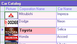
The RustemSoft DataGridPictureColumn represents a datagrid picture column style for displaying an image.
Usually the Picture column style is used to display graphics from a bitmap(BMP), icon, metafile, GIF, JPEG or PNG file.
The Picture is displayed by default without any borders in datagrid cell. You can provide a standard or 3D border using the BorderStyle property.
When you click the control the picture raises an event that you can grab in your code.
|
  Syntax Syntax
DataGridPictureColumn()
|
  Please read the DataGridColumns assembly documentation to learn more about the DataGridPictureColumn class provided events and class members. Please read the DataGridColumns assembly documentation to learn more about the DataGridPictureColumn class provided events and class members.
  DataGrid Print Class DataGrid Print Class

|
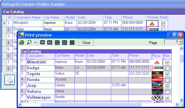
Obviously the DataGridPrint class is not a datagrid column style control. The service class is intended to help you to create a print output based on your datagrid content. The class has been included into assembly since it is build for .NET WinForms datagrid control and very helpful for your .NET datagrid design. It will help you to implement an application with a print preview and a print support.
The DataGridPrint class is used by the Print dialog and Print Preview dialog (on your .NET form) to draw the DataGrid object content that should be printed. An object of the class is used for a .NET PrintDocument object.
|
  Syntax Syntax
DataGridPrint(PrintDocument1, DataGrid1, bBlackWhite)
PrintDocument1 - System.Drawing.Printing.PrintDocument reusable object that sends output to a printer
DataGrid1 - System.Windows.Forms.DataGrid object that content you are going to print
bBlackWhite - boolean parameter that defines if you like to use "Black and White" printing mode or you would like to send to printer the real coloring that your datagrid control has currently on your form.
|
  How to implement a .NET application with the DataGridPrint class? How to implement a .NET application with the DataGridPrint class?
  Please read the DataGridColumns assembly documentation to learn more about the DataGridPrint class provided members. Please read the DataGridColumns assembly documentation to learn more about the DataGridPrint class provided members.
|

|
|